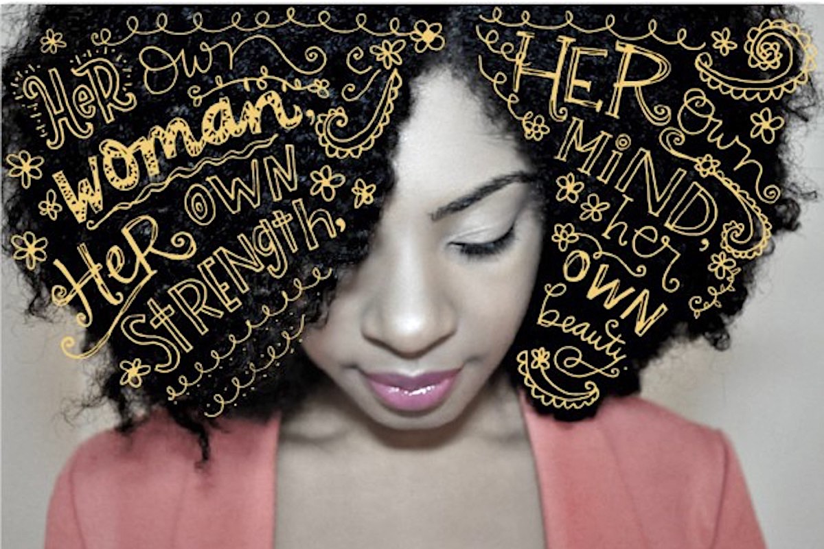
NaturalChica.com’s Maeling Murphy for Hallmark Mahogany Mother’s Day 2013, Featured Image
[dropcap]In[/dropcap] 1991 the Hallmark greeting card company, based in Kansas City, Mo., decided it was time to get serious about diversity. America was changing, as was Hallmark’s work force, and while the brand had dabbled in cards for black consumers since the 1960s, it didn’t have a perennial line that addressed them directly. [mc4wp_form id=”6042″]
Over the years, businesses of all kinds have had to acknowledge blind spots for racial exclusion, including “flesh-colored” crayons mixed and melted in dusty peach shades to cosmetics lines that offer few to zero options for dark complexions. Hallmark realized that speaking authentically to black people would require a slight shift in its traditional tone and direction. And so, 81 years after its founding, the company created Mahogany, its first year-round imprint dedicated to cards for the African-American community.

What makes a greeting card black? According to Dierdra Zollar, the editorial director for the Mahogany brand studio, sometimes it’s explicit, like a Father’s Day card bearing the silhouette of an African-American man, or a card touting “black love” for romantic occasions. Others, however, are more subtle.


You must be logged in to post a comment.